
Setup and the Basics
Add the starti.app SDK to your page, initialize it, and read basic device information
Setup and the Basics
This page covers adding the SDK to your page, initializing it, and the basics you need to know. For a full introduction to what starti.app is, see the Introduction.
To get up and running, you only need to do two things: add the SDK to your page and call initialize().
Add the SDK to your page
Add the SDK script and stylesheet to your HTML <head>. Replace {BRAND_NAME} with your brand name from the starti.app manager.
<script src="https://cdn.starti.app/c/{BRAND_NAME}/main.js"></script>
<link rel="stylesheet" href="https://cdn.starti.app/c/{BRAND_NAME}/main.css" />
The script creates a global startiapp object on window - no import or npm install needed. The CSS file provides utility classes and CSS custom properties for safe-area insets (see below).
You can also simply copy the snippet directly from the starti.app Manager.
Initialize the SDK
Call initialize() to activate the SDK. Wrapping it in a try/catch lets your site work normally in a regular browser while activating native features only when the container is present.
try {
  await startiapp.initialize();
  console.log("starti.app is ready!");
} catch (error) {
  console.log("Not running inside a starti.app container.");
}
The app's splash screen stays visible until initialize() is called. This gives you a chance to load images and other assets before the transition from splash screen to your content. Once initialize() is called, the splash screen fades out automatically.
You can also pass options to initialize() to configure the status bar, spinner, drag behavior, and more. See the App API reference for the full list of options.
Configure these in the Manager where you can. Every option initialize() accepts can also be set for your brand under Initialization settings in the starti.app Manager — it then applies everywhere in your app with no code, and changing it is a publish rather than a new release of your website. Pass options in code only for values that can only be decided at runtime; what you pass wins property by property, so the rest of the brand's configuration is left alone.
Other ways to initialize
The try/catch pattern above is the simplest approach, but there are two other options depending on your setup:
Using the ready event — useful if you want to wait for the native bridge before initializing:
startiapp.addEventListener("ready", async function () {
  startiapp.initialize();
  console.log("starti.app is ready!");
});
You can register multiple listeners, and if you register one after initialization has already completed, the callback fires immediately — you never miss the event.
Using isRunningInApp() first — useful when you only want to initialize inside the app:
if (startiapp.isRunningInApp()) {
  await startiapp.initialize();
  console.log("Native features are available.");
} else {
  console.log("Running in a normal browser - native features are disabled.");
}
initialize() should only be called once — typically early in your app's lifecycle. If your app is a single-page application, call it at the top level, not on every route change.
Detect if running in the app
The synchronous helper isRunningInApp() returns true when your code is running inside the starti.app container. This is useful when your JavaScript logic needs to branch depending on the environment — for example, choosing between a native scanner and a web-based fallback.
if (startiapp.isRunningInApp()) {
  // Use the native QR scanner
  const result = await startiapp.QRScanner.scan();
} else {
  // Fall back to a web-based scanner library
}
If you just need to show or hide UI elements, use the CSS utility classes instead — no JavaScript needed.
If you need to detect the app server-side, check whether the User-Agent HTTP header contains starti.app.
Preview in a browser
You don't need a phone to test your app. Chrome DevTools lets you add a custom device that mimics the native app's screen size and user agent, so the SDK behaves as if it's running inside the starti.app container. This is handy for quickly iterating on layout and styling.
See the Simulate the App in a Browser guide for step-by-step instructions.
Handling errors
The SDK logs warnings to the console when something goes wrong (for example, calling a native API outside the container). You can also listen for error events globally.
startiapp.addEventListener("error", function (event) {
  console.error("starti.app error:", event.detail);
});
This is useful for logging and diagnostics - it catches errors dispatched by the native bridge.
Listening for events
The app communicates with your website through events. Each SDK module has its own events that you can listen for using addEventListener. The pattern is the same across all modules:
startiapp.PushNotification.addEventListener("tokenRefreshed", (event) => {
  console.log("New push token:", event.detail);
});

startiapp.App.addEventListener("appInForeground", () => {
  // Refresh data when the user returns to the app
});
Event callbacks receive an event object where event.detail contains the event data. Some events (like appInForeground) have no data — the callback is simply invoked when the event occurs.
You have already seen two global events above: ready (fired when the native bridge is available) and error (fired when the SDK encounters an issue). Individual modules fire their own events — see each module's API reference for the full list.
CSS utility classes
The SDK automatically adds a startiapp attribute to <body> when running inside the app. You can use this attribute as a CSS selector to apply app-specific styles:
/* Change background color only inside the app */
body[startiapp] {
  background-color: #f5f5f5;
}

/* Hide a navigation bar inside the app */
body[startiapp] .browser-nav {
  display: none;
}
The SDK also injects utility CSS classes you can use to show or hide content based on the environment:
| Class | Behavior |
|---|---|
startiapp-show-in-app | Visible only inside the native app |
startiapp-hide-in-app | Hidden inside the native app |
startiapp-show-in-browser | Visible only in a regular browser |
startiapp-hide-in-browser | Hidden in a regular browser |
<p class="startiapp-show-in-app">You are using the native app!</p>
<p class="startiapp-show-in-browser">Download our app for the best experience.</p>
The SDK also carries the page's layout on <body> as startiapp-width and startiapp-nav —
see Adapt to a wide screen or a foldable.
The keyboard-open attribute
Inside the app the SDK also puts a startiapp-keyboard-open attribute on <body> for as
long as the software keyboard is up, and takes it off again when the keyboard goes. It is
the CSS counterpart of the keyboardOpened and
keyboardClosed events — style with the attribute, and
listen for the events only when something has to do something (scroll a list back to the
bottom, refetch a measurement).
/* Get a floating action button out of the way while the user is typing */
body[startiapp-keyboard-open] .fab {
  display: none;
}

/* Give a chat composer a tighter footer when the keyboard has the bottom of the screen */
body[startiapp-keyboard-open] .composer {
  padding-block-end: 0;
}
The app has already resized the web view to the room the keyboard leaves, so your layout has reflowed before the attribute appears — use it to change what is shown, not to make room. The attribute only ever appears inside the app, and only on app shells new enough to send the keyboard events, so treat it as an enhancement.
CSS custom properties (safe-area insets)
The SDK provides CSS custom properties for device safe-area insets. Use these to avoid content being hidden behind notches, status bars, or home indicators.
| Property | Description |
|---|---|
--startiapp-inset-top | Top safe area (status bar / notch) |
--startiapp-inset-right | Right safe area |
--startiapp-inset-bottom | Bottom safe area (home indicator) |
--startiapp-inset-left | Left safe area |
Each property is the part of that edge your page has to pad for itself, so you can apply all
four without padding anything twice. Top and bottom are 0px unless you remove that safe area
with removeSafeArea. Left and right are 0px unless
you take the sides with advancedSafeAreaOptions.sides — until then the app keeps the web view
clear of them itself (see Move your icon bar where the platform puts its
own).
body {
  padding-top: var(--startiapp-inset-top, 0px);
  padding-bottom: var(--startiapp-inset-bottom, 0px);
  padding-left: var(--startiapp-inset-left, 0px);
  padding-right: var(--startiapp-inset-right, 0px);
}
The properties are updated in place when the device rotates, or when a foldable phone is folded or unfolded — the page is not reloaded.
Always provide a fallback value (e.g. 0px) when using these properties so your
page looks correct in a regular browser where the variables are not set.
Adapt to a wide screen or a foldable
When a foldable phone such as iPhone Duo is folded or unfolded, or a phone is turned on its side (once you have enabled screen rotation), the web view changes size without a reload — the same as resizing a browser window — and your page's own media queries react straight away.
On top of that, the SDK tells your page two things about its layout, in the same words on iOS
and Android. Inside the app they are attributes on <body>, so CSS alone can follow them:
| Attribute | Values | Meaning |
|---|---|---|
startiapp-width | compact, wide | How much room the page has, as the platform itself sees it. wide on an unfolded foldable, a large phone on its side or a tablet. |
startiapp-nav | bottom, left, right | The edge your own icon bar belongs on. bottom on almost every phone; right on iPhone Duo, whose status bar runs down that side. |
Move your icon bar where the platform puts its own
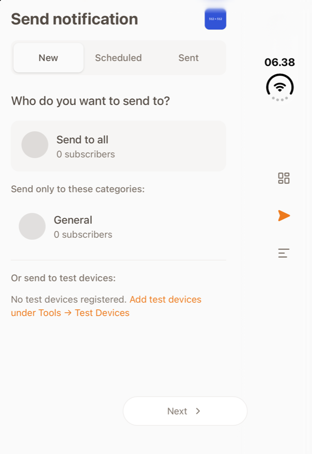
On iPhone Duo the status bar sits in a column down the right-hand side of the screen when the phone is folded, and the system stands its own toolbars and tab bars in that column, beneath the status bar. Two steps do the same for yours.
1. Follow startiapp-nav. One rule moves the bar to the side:
/* The icon bar sits along the bottom, as on every phone... */
.app-nav {
  position: fixed;
  inset: auto 0 0 0;
  display: flex;
}

/* ...and down the side where the status bar is, on phones that have it there */
body[startiapp-nav="right"] .app-nav {
  inset: 0 0 0 auto;
  flex-direction: column;
  justify-content: center;
}
By default the app keeps your page clear of the status bar column, so this puts the bar just beside it, with no inset to add.
2. Stand the bar in the column. Ask for the sides of the screen, and the app lays your page
out to the left and right edges and hands you the room to keep clear as
--startiapp-inset-left and --startiapp-inset-right — the status bar column on iPhone Duo,
the notch on a phone turned on its side:
await startiapp.initialize({
  statusBar: { advancedSafeAreaOptions: { sides: { removeSafeArea: true } } },
});
Then pad your page by the side insets, and let the icon bar fill the column — at least as wide as the column, and never narrower than the bar itself:
body {
  padding-left: var(--startiapp-inset-left, 0px);
  padding-right: var(--startiapp-inset-right, 0px);
}

body[startiapp-nav="right"] .app-nav {
  inset: 0 0 0 auto;
  width: max(64px, var(--startiapp-inset-right, 0px));
  flex-direction: column;
  justify-content: center;
}
The body already keeps the column clear, so your content only has to clear whatever part of
the bar is wider than the column. Elements with position: fixed are laid out against the
screen rather than the body, so give your overlays (sheets, toasts, banners) the same side
insets. Everywhere else startiapp-nav is bottom and nothing
changes. The top-level removeSafeArea never affects the sides, so pages that only use it keep
working exactly as before.
iPhone Duo hands the status bar column to apps built with the iOS 27.1 SDK. Until your app is,
it runs your page beside the status bar, the side insets are 0 and startiapp-nav is
bottom — so the same CSS is right on both.
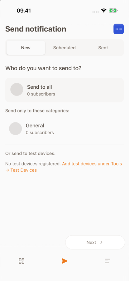
Here is the starti.app Manager doing exactly that — on an iPhone, and on a folded iPhone Duo:
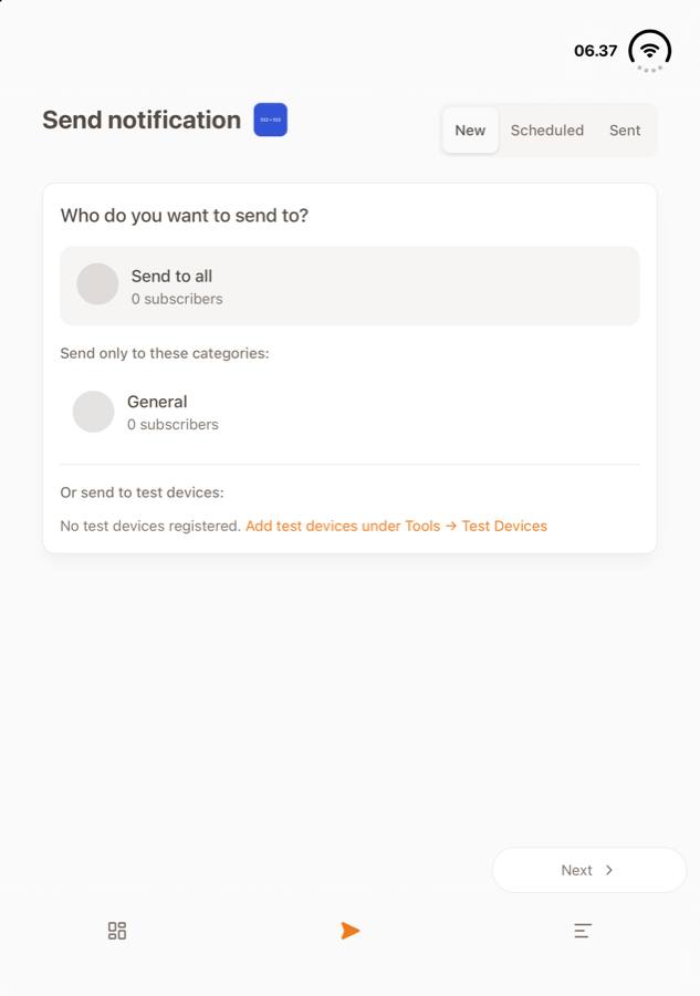
Unfolded and held upright, iPhone Duo puts its status bar back along the top, so
startiapp-nav returns to bottom and the bar with it:
Use the extra room when the phone is wide
startiapp-width="wide" is the platform's own answer — the same moment iOS and Android lay their
apps out in more than one column — so you do not have to pick a breakpoint per device:
body[startiapp-width="wide"] .content {
  display: grid;
  grid-template-columns: 1fr 1fr;
}
In JavaScript
The same layout is startiapp.App.layout, and
layoutChanged fires once each time it changes:
const { width, navigation } = startiapp.App.layout;

startiapp.App.addEventListener("layoutChanged", (event) => {
  console.log(event.detail.width, event.detail.navigation);
});
The attributes are only on <body> inside the app; startiapp.App.layout answers in a browser
too — see what it reports there.
Read device information
Once the SDK is initialized, you can query the device platform, device ID, and brand ID.
Platform is a synchronous property that returns "ios", "android", or "web".
const platform = startiapp.App.platform;
console.log("Platform:", platform); // "ios" or "android"
Avoid building platform-dependent functionality. Your app should work the same way on both iOS and Android. In rare cases where you need to differentiate, platform is available — but treat it as an exception, not the norm.
Device ID and Brand ID are asynchronous because they call into the native bridge. The device ID is unique to the current app installation — if the user uninstalls and reinstalls the app, a new ID is generated.
const deviceId = await startiapp.App.deviceId();
console.log("Device ID:", deviceId);

const brandId = await startiapp.App.brandId();
console.log("Brand ID:", brandId);
You can also read the app version.
const version = await startiapp.App.version();
console.log("App version:", version);
deviceId() and brandId() cache their results after the first call, so calling
them multiple times is cheap.
Complete working example
Here is a complete HTML page that ties all the steps together. Save it as an HTML file, replace {BRAND_NAME} with your brand name, and test it on a real device.
<!DOCTYPE html>
<html lang="en">
  <head>
    <meta charset="UTF-8" />
    <meta name="viewport" content="width=device-width, initial-scale=1.0" />
    <title>starti.app Getting Started</title>

    <!-- Load the starti.app SDK -->
    <script src="https://cdn.starti.app/c/{BRAND_NAME}/main.js"></script>
    <link rel="stylesheet" href="https://cdn.starti.app/c/{BRAND_NAME}/main.css" />

    <style>
      body {
        font-family: sans-serif;
        padding: 1rem;
        /* Use safe-area insets provided by the SDK */
        padding-top: calc(1rem + var(--startiapp-inset-top, 0px));
        padding-bottom: calc(1rem + var(--startiapp-inset-bottom, 0px));
      }
    </style>
  </head>
  <body>
    <h1>Device Info</h1>
    <p class="startiapp-show-in-browser">
      Open this page inside the starti.app native container to see device info.
    </p>
    <div id="info" class="startiapp-show-in-app">
    </div>

    <script type="module">
      try {
        await startiapp.initialize();

        // Read device info
        const platform = startiapp.App.platform;
        const deviceId = await startiapp.App.deviceId();
        const brandId = await startiapp.App.brandId();
        const version = await startiapp.App.version();

        const info = document.getElementById("info");
        info.innerHTML = `<p>Platform: ${platform}</p>` +
          `<p>Device ID: ${deviceId}</p>` +
          `<p>Brand ID: ${brandId}</p>` +
          `<p>Version: ${version}</p>`;
      }
      catch (error) {
        console.error("Failed to initialize starti.app SDK - not running in app :-(");
      }
    </script>
  </body>
</html>
If you use a framework like React, Vue, or Svelte, the pattern is the same: load the SDK via script tag in your index.html, then use the global startiapp object in your components. Call startiapp.initialize() early in your app's lifecycle (for example, inside a React useEffect or a Vue onMounted hook), and use the ready event to gate native feature calls.
AI Coding Agents
Point Claude Code, Codex, Cursor, and other coding agents at the starti.app documentation so they write correct SDK code
Push Notifications
Set up push notifications in your starti.app-powered app — from no-code Manager broadcasts to per-user targeting and advanced FCM token management